You need LiveCode 8.1.10 or LiveCode 9 to use these widgets.
For a start you could use the free Community edition if you are downloading the open source widgets (marked with a *).
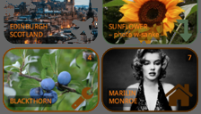
Use a grid of draggable/clickable icons containing color, image, svgIcon, text
Installation
1 Start LC 8/9. 2 Download the
extension file (.lce) 3 Install the widget by selecting the lce file from menu
Tools/Download Manager and its button "+" at topright. 4 Quit and restart LC 8/9. 5 Download and open the
sample stack
widget.icongrid version 2.1.1 [-hh fecit 2018]
Instead of step 5 above you may also use
"go stack URL" from the LC message box.
Paste in LC's msg to load stack into RAM.
Main Features and Hints
The widget displays a rectangular grid of draggable colored rectangles (optionally rounded) that may serve as "buttons".
You define the grid's number of elements by selecting ROWS x COLUMNS.
Each grid element has "properties":
SVGPath (especially all named SVG icons),
TEXT (may be multi-line),
IMAGE (from local disk or server, jpeg or png),
FILLCOLOR and STROKECOLOR,
NUMBER (only readable for identifying the element),
VCD = visible, clickable, draggable.
LAYERING. The order of drawing is is as follows: Color (Fill), Image, SVG, Text, Color Color(Stroke).
So you have the option to put Text and an SVG on top of an image. The SVG can be clipped to the grid element's opaque region. The image is always clipped by the (rounded) rectangle of the grid elements.
There are two "resizing modes".
mode AdjustSizeOfWidget:
adjust the widget's size to the number of grid elements and their (unique) element size
mode ResponsiveSize:
adjust the size of each grid element to the widget's size.
The most basic grid options are:
For the widget or (uniform) for each grid element: GridRows, GridColumns, TotalWidth, TotalHeight, GridWidth , GridHeight, GridDistance, GridLeft, GridTop, GridRadius (rounded corner), gridStrokeWidth, FillColor, GridTextFont, GridTextSize, ShowSVGPathes, ShowTexts, ShowNumbers, ScaleFactorSVG, ScaleFactorImg, AllImagesMode.
More Options for rotating the widget or all elements in steps of 90 degress and for reordering the grid elements are available.
There are three "click modes" (if an element is clickable):
CLICKED a grid element.
DRAGGED one element and dropped it to reorder the grid.
CANCELLED is leaving the widget's rect while dragging (order is restored, the dragged element snaps back to the drag start).
You'll then get an info as property THE CLICKINFO of the widget:
The click mode, the clicked/dragged element's number, the start-from grid-cell, the drop-to-grid-cell, and the moved object's special properties (objectPath, objectText, objectImage and objectColors).
REORDER. Besides dragging it is also possible to reorder the grid elements by script using the property gridOrder, see also the PropertyInspector/Custom. You can there simply drag and drop the numbers to reorder the grid.
CANCEL DRAG. While dragging the widget's rect shows a dashed outline. Leaving this dashed rectangle with the cursor's hotspot cancel's the drag and the dragged element snaps back to its grid cell where it came from.
GRAB. Click any pixel of the widget's background (whether opaque or not) and then drag slowly to grab the widget. Invisible elements are not part of the background.
After installation of the widget and restarting LiveCode find detailed help in the dictionary.